Nourished Mind Counseling
Nourished Mind Counseling needed a brand that felt professional without feeling clinical, approachable without feeling juvenile, and personal without losing credibility.
I started by unpacking the meaning behind the name and Kelsi's approach to counseling, looking for visual connections between nourishment, growth, the mind, and the idea of interconnectedness. Early exploration included botanical forms, brain imagery, water, organic shapes, and systems of connected pieces. These ideas became the foundation for the identity rather than simply decorative inspiration.
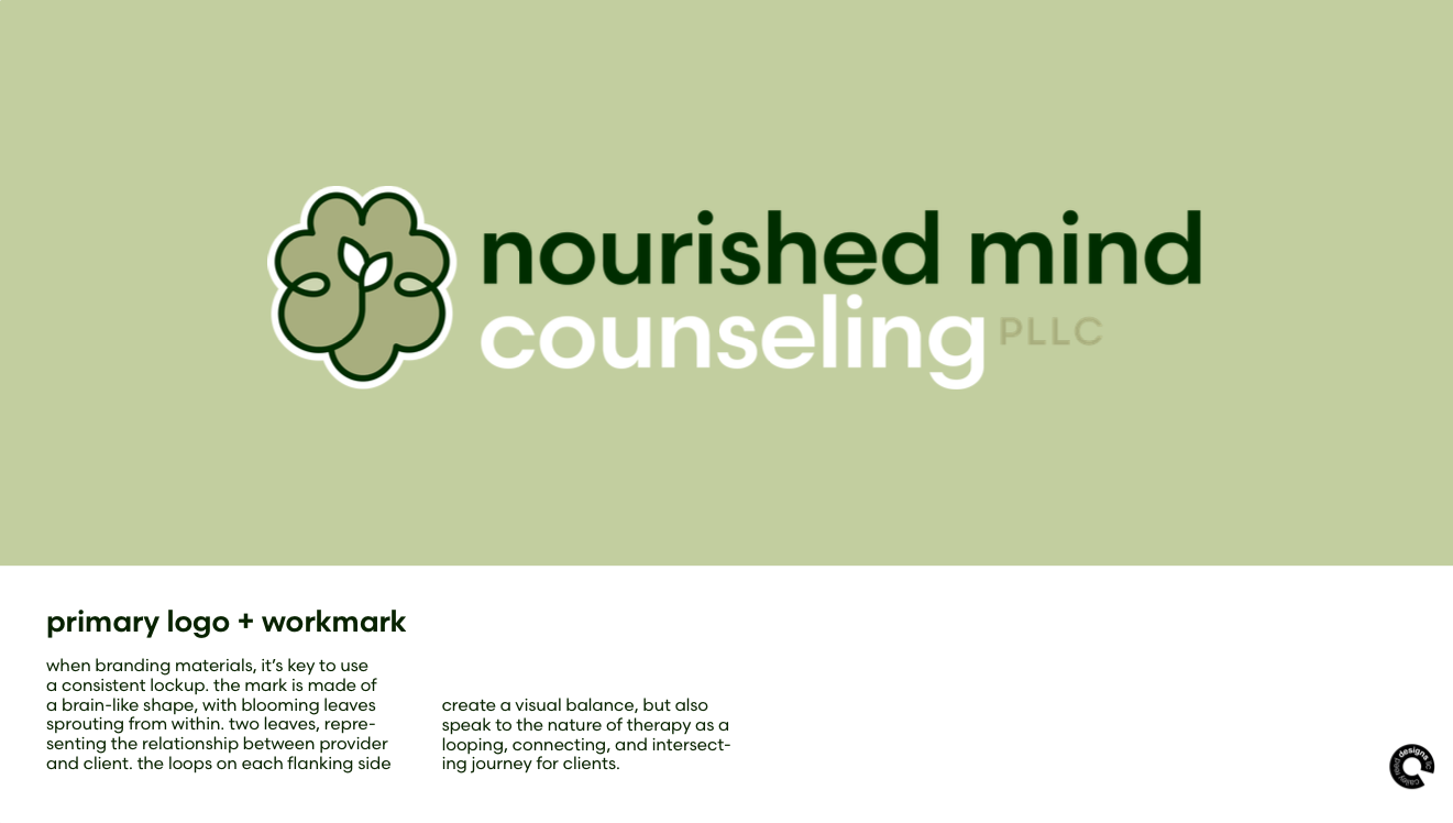
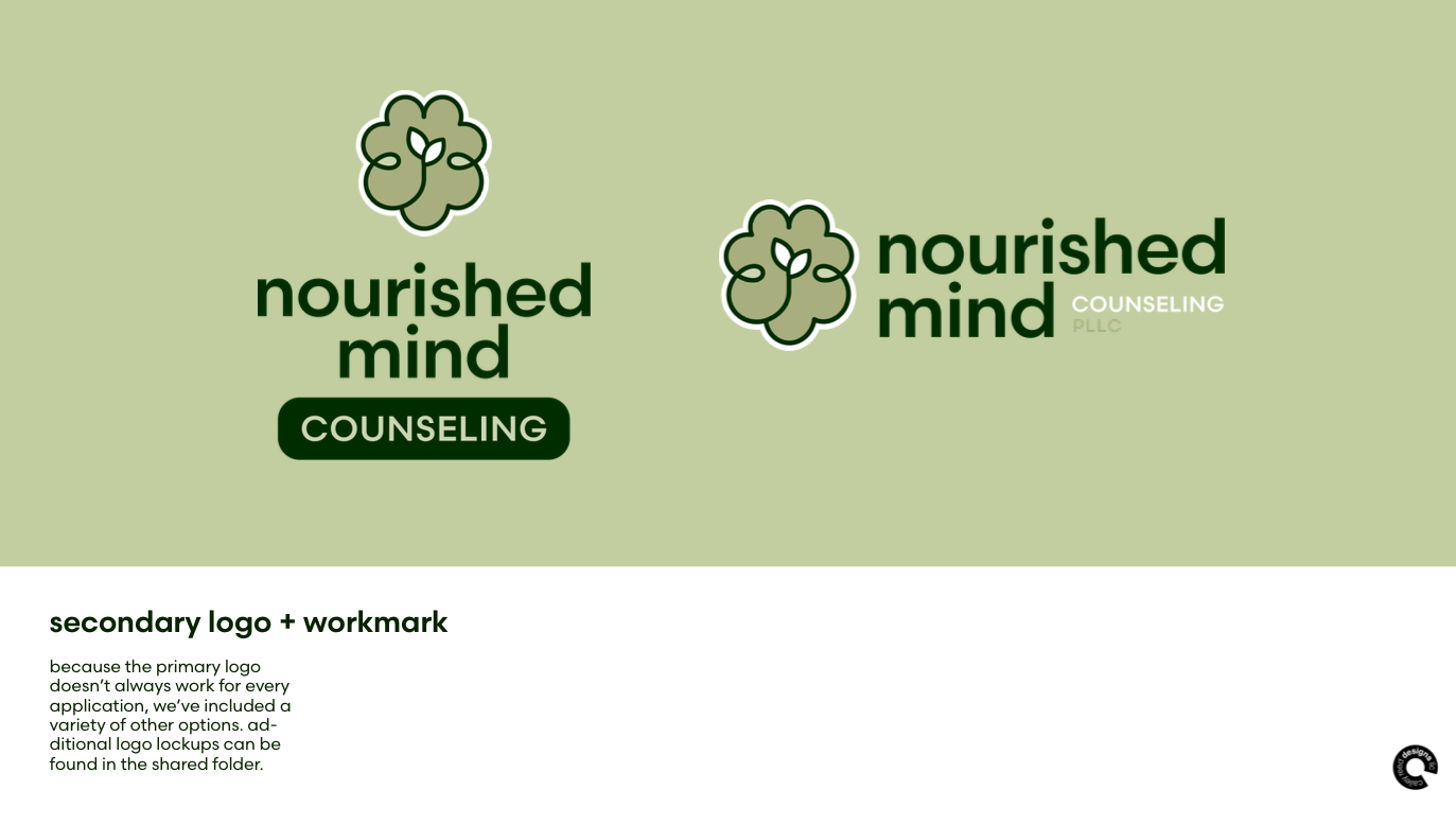
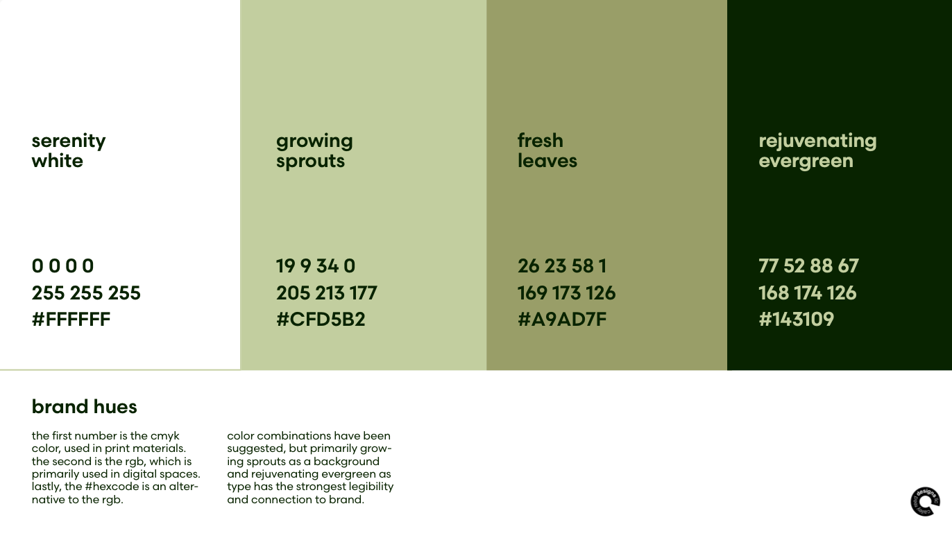
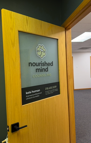
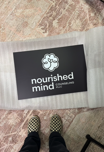
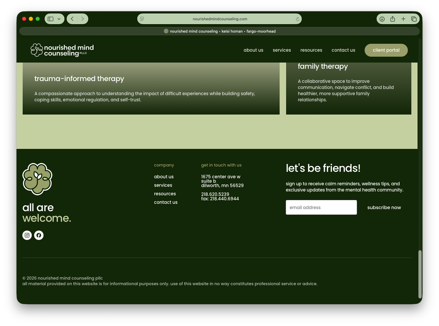
Through several rounds of concept development and refinement, I developed a mark that sits somewhere between an abstracted brain and a growing bloom. The forms are intentionally interconnected, reflecting the layered nature of mental health and the individual pieces that make up someone's journey. A soft, monochromatic green palette and lowercase typography reinforce the sense of calm, warmth, and approachability Kelsi wanted the practice to communicate.
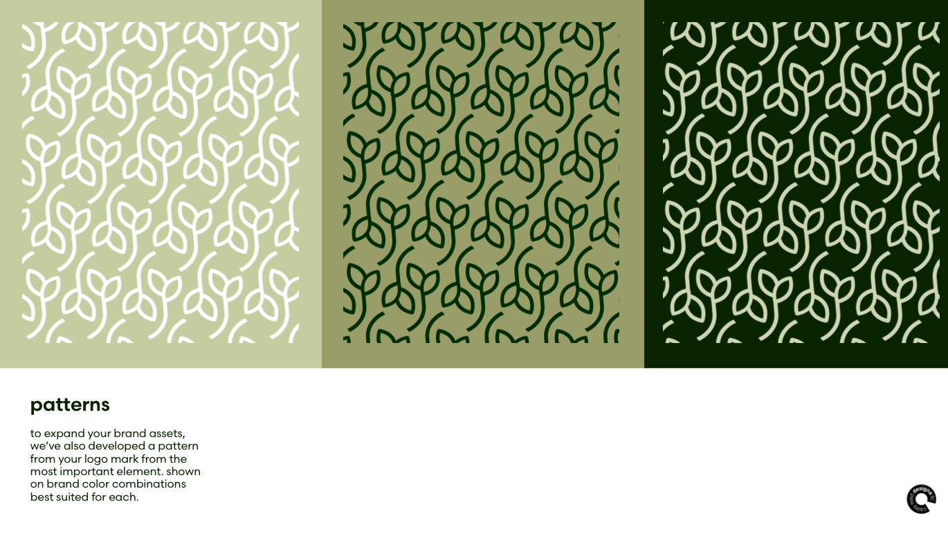
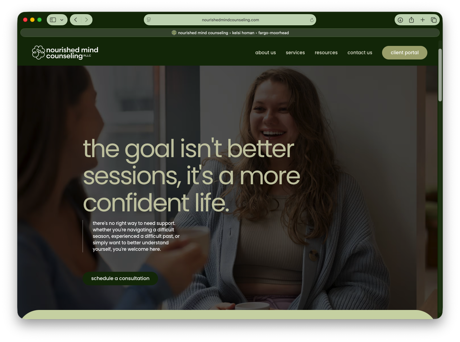
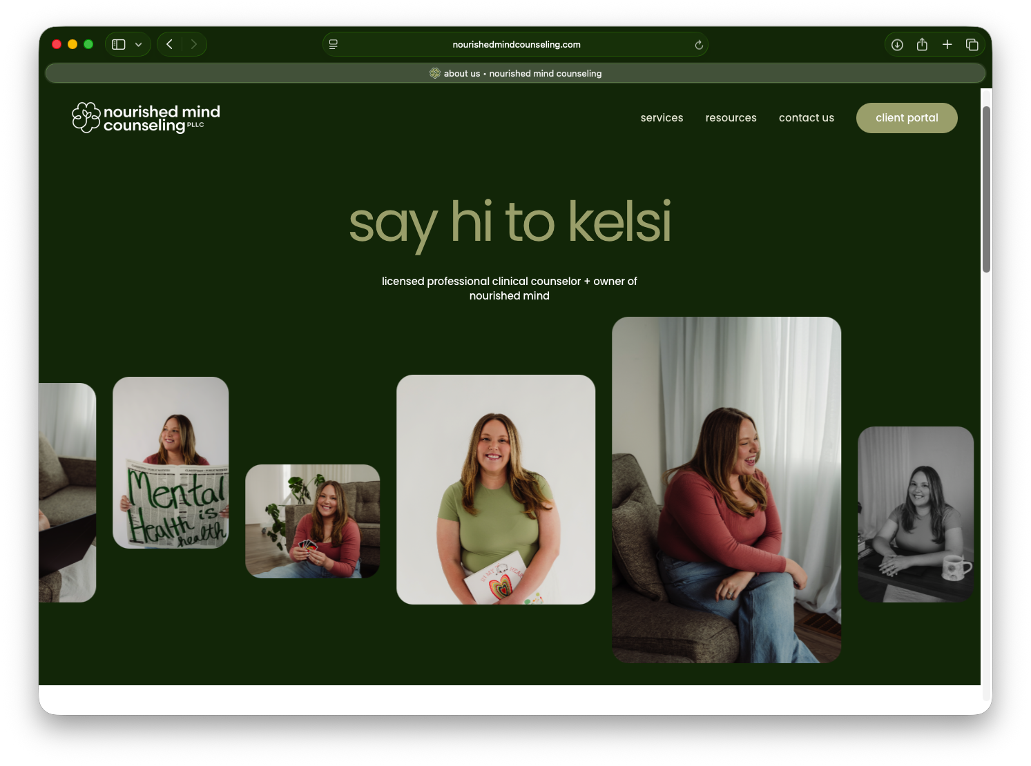
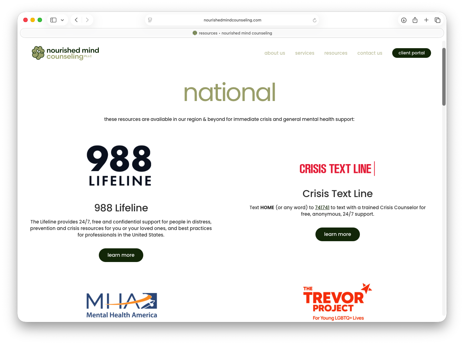
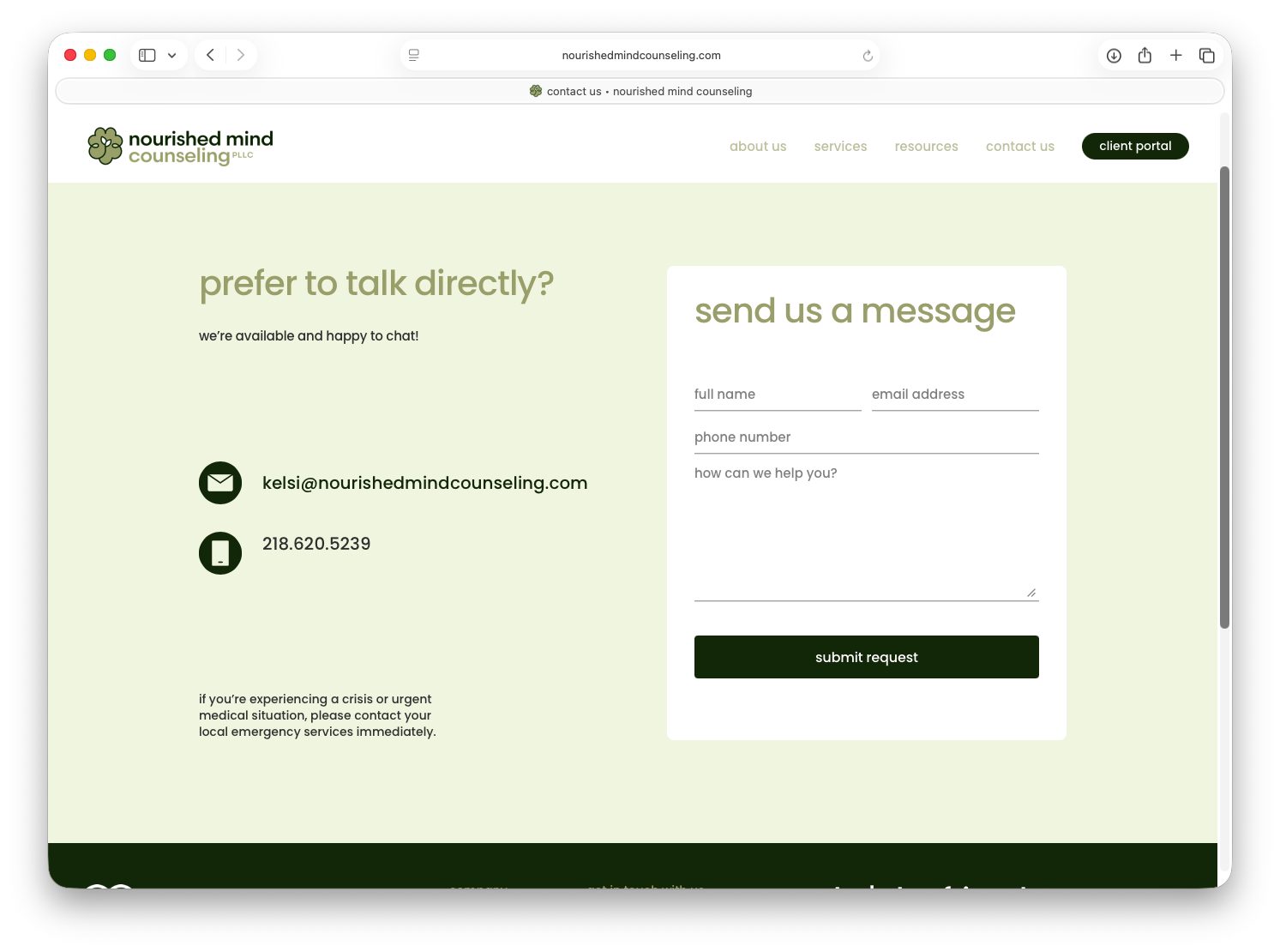
Once the identity was established, I expanded it into a complete brand system and standards guide before moving into web development. The website was designed as an extension of the brand—not simply a place to house information, but a first point of contact for someone who may already feel vulnerable about seeking therapy. Content, hierarchy, navigation, and visual decisions were all considered through that lens.
The result is a cohesive brand and digital experience that gives Nourished Mind a recognizable presence while still feeling personal, warm, and true to the person behind the practice.
View full website here: www.nourishedmindcounseling.com